News &
Stories
Hints, tips and advice from digital print & direct mail experts
We are here for all your print and mail needs, taking all the stress away with everything under one roof. Delivering great value, customer service and quality print every time.

From Strength to Success: EDWPS and Eight Plus Achieve New Heights in 2023
Explore the remarkable journey of EDWPS and Eight Plus in 2023, achieving new heights in print, sustainability, and success through innovative initiatives, awards, and community involvement.
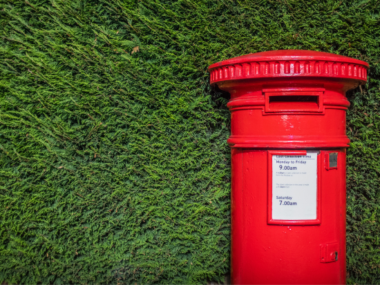
Royal Mail Wholesale Price Increase July 2024
Royal Mail has announced a significant price hike for its wholesale services starting July 2024. Find out what this means for you and your business.
Find out more
B Corp Customer Impact Area: Enhancing Customer Value
Customers: Our Most Valued Asset.
At Eight Days a Week Print Solutions, we deeply value our customers, as reflected in our impressive score of 4.8 out of 5 for the fifth pillar of our impact assessment – Our Customers.
Find out more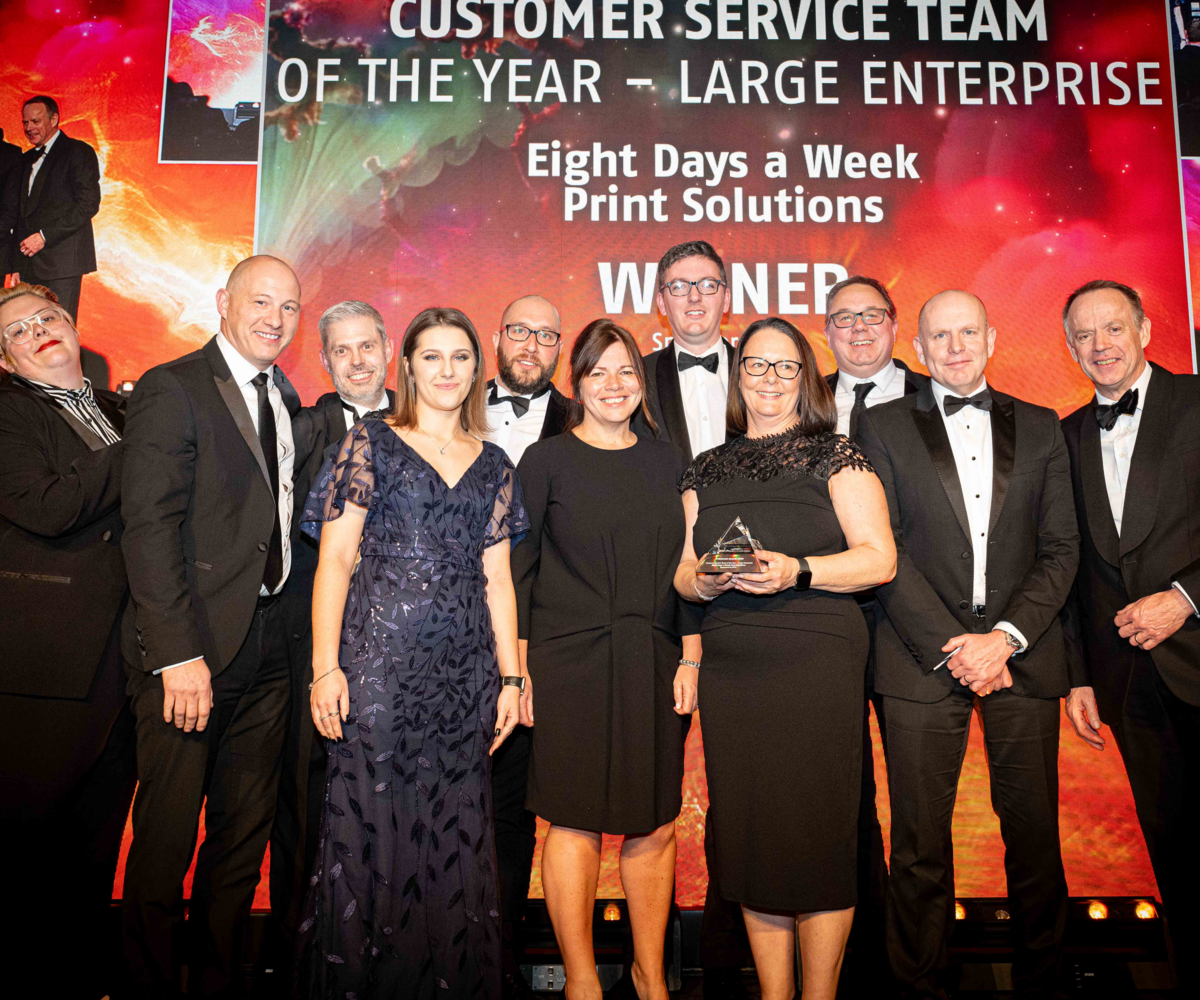
Customer Service Team of the Year at Printweek Awards 2024
We are thrilled to announce that Eight Days a Week has been awarded the prestigious Customer Service Team of the Year for large enterprises at the Print Week Awards 2024.
Find out more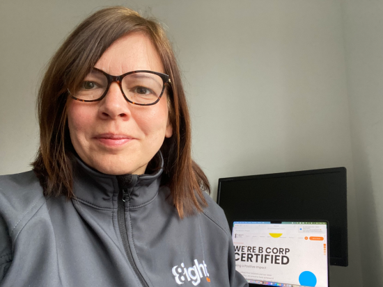
Journey to becoming a B Corp
Dive into our Q&A with our very own Caroline Varley, who went through the process from start to finish.
Find out more
B Corp Environment: Building a sustainable future with our Environmental Commitments
As a print company with a multitude of materials and processes, we understand the critical importance of environmental management. We know that our operations have the potential to impact the environment significantly if not managed properly. That is why we are committed to upholding the highest standards of environmental responsibility across all areas of our business.
Find out more
What is Data-Driven Marketing? 8 strategies you need for your next direct mail campaign
These days, marketing is only as good as your data set. In order to make sure your next campaign has the impact you desire, it’s crucial that your customer records are up-to-date and accurate.
Find out more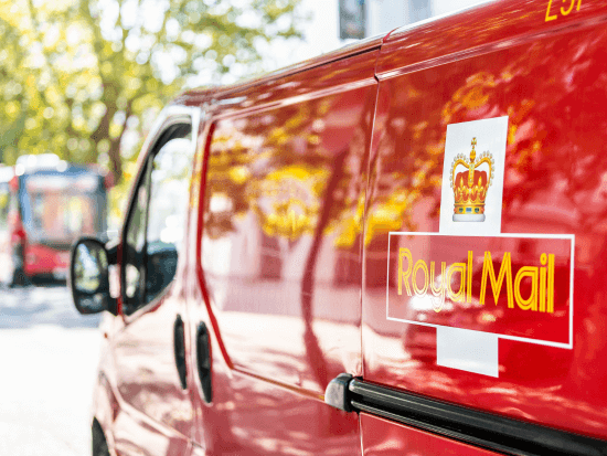
Navigating the Future of Direct Mail: Adapting to proposed Reform of Royal Mail USO
The Ofcom report on its proposals to reform Royal Mail’s Universal Service Obligation (USO) has been causing quite the stir in the mail and print industry.
Find out more
The best types of paper for printing
When it comes to choosing the best printing paper for your job…there’s a lot of choice. Our guide to different types of paper will take you through the basics.
Find out more
B Corp Community Impact Area: Building Strong Communities
Let’s dive deep into the B Corp Community Pillar, where we underwent a comprehensive evaluation of 36 thought-provoking questions.
Find out more
B Corp Workers Impact Area: Empowering Employees
Welcome to our blog series on our B Corp certification! At Eight Days a Week Print Solutions and Eight Plus, we believe in doing business the right way, and that includes taking care of our most valuable asset: our employees.
Find out more
Multi-award Winners
We won Printweek's SME of the Year and Customer Service Team of the Year in 2022.

Eco print solutions
We care about tomorrow, so we're taking care to be a sustainable business.

Print management
Through our sister company, Eight Plus, we can oversee the whole job for you, from proofing, to print, to postage.

Added Value
Our team goes the extra mile to make every job stand out and surpass your expectations.